The launch of our new corporate image
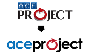
Those who follow us on Facebook, Twitter and LinkedIn have already seen the new logo we unveiled two weeks ago. This new logo is the beginning of a series of major changes to our corporate image. We’ve decided to start with the logo. The website will follow. Our social media presence will also increase. And eventually, AceProject’s look and feel will change for the better. We’re on fire, so we hope you’re ready for this!
Concept behind the logo
We wanted to keep the arrow in our new logo. The arrow represents the progression of a project, from start to finish. We also wanted the new logo to be fresh… Just like us.
Something sweet for your computer screen
Here’s a 1920×1080 wallpaper with our new logo and slogan.
How do you like our new logo?


Hi Aceproject, I love the new logo. Although the old one was fine and, to me, quite up-to-date, the new one is fresh, as you said. I am also happy that you kept the arrow. That is Aceproject. Keep the fire burning, and I know that you will increase in this burgeoning market. All the best, Judy
Nice new logo, we looked into AceProject probably a year ago, the unlimited user option in the free basic package is a nice choice for the market specially with so many options out there… it is a nice way to break the ice. As for the logo, we need to update the one we were using. Cheers!